In our last article The Power of Dashboards in Market Research Today we had a look at the major benefits of dashboards and how you can visually enhance your market research data. Having built over 100 dashboards at Yonder Data Solutions, we’d like to provide what we see as emerging trends in this area-
Less is more
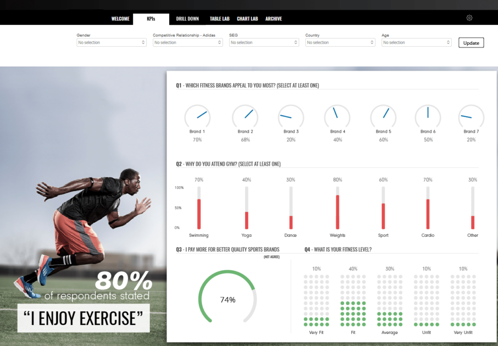
While this may sound like an obvious trend, it is often thought good practice to include as much data on a dashboard as possible. A dashboard is meant to provide quick and meaningful insight without any distraction or clutter. To achieve this we always ask our clients two questions:
- What are they trying to find out?
- What is the story they are trying to tell?
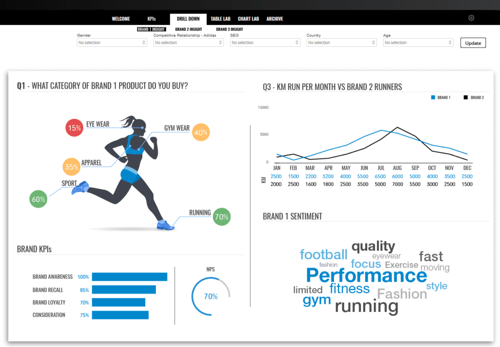
This assists in understanding what information will be displayed. If further information is needed, a drill down or click through function is possible.
Take away: Ask the right questions in order to display the optimum key metrics
Data to visuals
With a growing demand for even faster turnaround times from survey completion to when a dashboard goes live – the most requested solution in recent months has been for our template based dashboard. Affordable, flexible and fast to implement this ready-to-go interface works around your data.
Take away: Clients need to see their research results quickly in a way that allows analysis stripped of clutter and confusion – templates and prebuilt solutions seem to be increasing in demand
Custom solutions
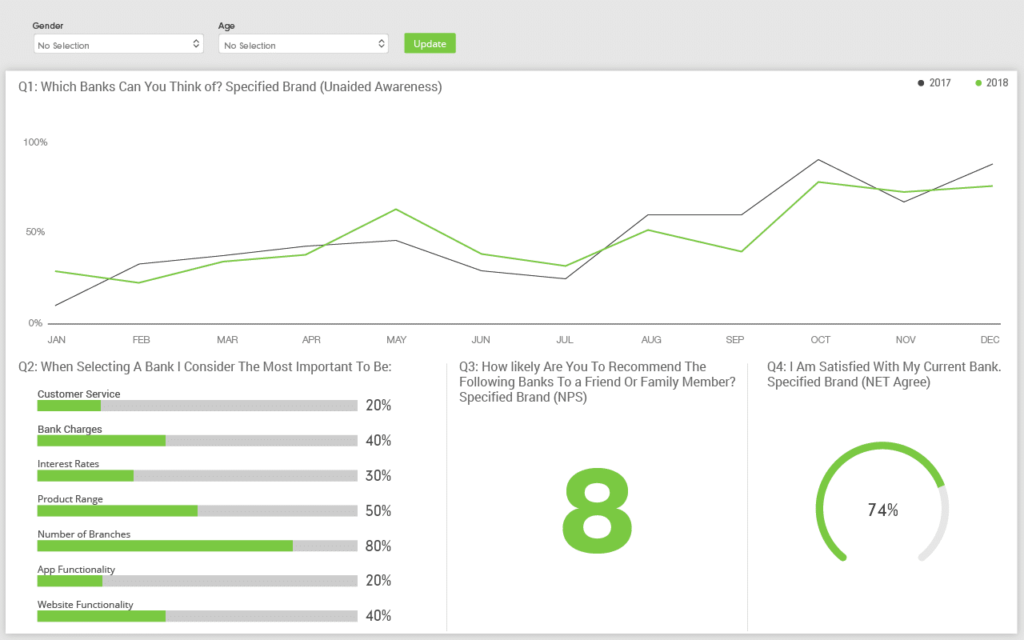
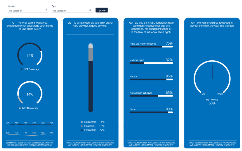
With more and more companies recognizing the power of dashboards to visualize their research, we have seen an increase in the amount of requests for bespoke solutions able to utilise large data sets. Dashboards provide the ability to present large amounts of information in an engaging and meaningful way. These solutions offer the ability to manipulate and interrogate the data with added functionality to export cross tab information for quick ad hoc analysis.
Take away: Dashboards can be used for both small and large research projects. They help clients make sense of large amounts of data, gain insight and identify trends while at the same time assist in making quick informed decisions.
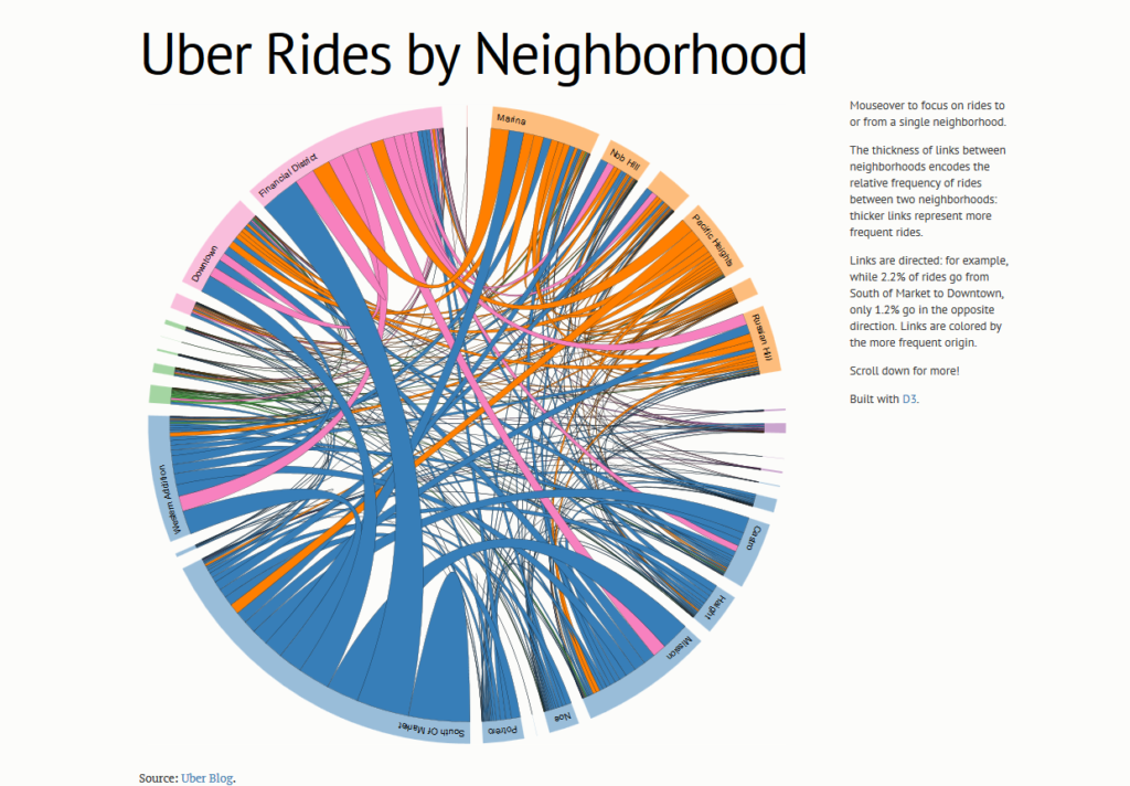
D3.js
D3 is an exciting and powerful Javascript based library that allows the production of truly interactive and animated web-based visualisations. This enables users to experience data in an engaging and dynamic way. D3 works with various types of data including social media data, market research data as well as live data feeds. With dashboards continuing to grow in popularity, data visualization tools like D3 are expected to become commonplace in market research dashboards.
What do we do?
We are a trusted fieldwork and data collection partner.
We utilize class-leading software Dapresy which has been specifically designed for the market research industry (works directly on respondent level survey data). This coupled with our ability to create on-brand, bespoke dashboards to suit our clients’ requirements provides us with the tools needed to create a streamlined and efficient solution for you.
Award winning solutions
Yonder Data Solutions are an award winning survey and data delivery agency. We support leading insight, media and strategy agencies to provide state of the art data capture, delivery and visualisation solutions, whilst staying true to the ethos of robust research.

If you would like to talk further on how we can support your dashboard requirements, please email Shashi: shashi.lakhani@yonderdatasolutions.com